There are a lot of tools of the trade you will use to increase the sales! Check, if you don’t use one of the ways described here – it high time to start using it as well. Test different solutions and make changes, implement something new and increase sales.
They say that chat tabs in a website only irritate users, however, useful requests usually significantly outnumber discontented visitors. Online consulting services usually give you a lot of opportunities up to the payment straight in the chat tab. You can easily choose a convenient software for you with all the necessary features.
Invoke your customers to communicate in a chat and show them your willingness to guide them on all their questions.
Real users’ feedback increase the audience trust to the company. It is better to ask visitors to leave detailed testimonials about an agency’s services and objects with the description of their pros and cons. Some companies leave only 100% positive feedback and delete negative ones. You should not deal with negative comments like this, it is better to give an expanded answer and try to solve the customer’s problem.
The presence of negative feedback can also become a reason for choosing you.
When a person entrust an agency or realtor the representation of their interests in legal transactions, they try to avoid problems and get a high quality service. That is why when an agency tells about guarantees in public, users are more likely to apply to this company. For example, an agency can take upon itself the home owner’s interests protection in cases of claims.
The important section block of the site will help you to take all the possible objection of the audience off the table and convince in making risk free deals. Think carefully which questions and hesitations may have your potential customers and give detailed answers to each point.
Trivial but essential advice. Object search must work in a correct way. There is nothing more irritating for a customer than entering particular parameters and get search results that do not meet their demands.
Visually underline the benefits the clients get while choosing you. Bulleted lists, icons, frames, background color and others will help you to attract the clients’ attention to the special offer.
You must place several options of lead-capture forms: feedback-form, order a call, newsletter subscription. The objective of a site is not only to sell but at least make a client interested and leave you their contact details.
Users do not like filling in long forms with personal details. Ask for minimum amount of information, that is needed to contact a customer.
Discounts always work. Due to a small decrease of the price you increase sales, as you enlarge the number of customers, who will be able to afford your service. This method will be one of the arguments for you.
Time limit is another incentive for applying in an agency now, not in an indefinite moment in the future. Special offers that last “forever” start being dubious and make the clients question the value of your services.
Point out special offers and discounts visually. Bright visual accents like icons “Bestseller”or “Best offer” will attract a client’s attention.
When a user leaves a site you can use your last chance to get his contact details by a pop-up form with some bonuses from a company or an offer to subscribe to newsletters and updates of objects database. However, do don be too pushy. You should not set such forms in each page of the site, as a user will easily get sick and tired of this.
The usage of real agent photos instead of common icons of a telephone receiver will no doubt increase a user’s credit and desire to apply for your services.
It has been checked with a lot of different tests that people tend to click buttons more often. That is why if you have action links, change them into buttons. It is better if the color of the button is different from other colors in a page as it should be bright. Do not use color of the button in other places of the site, in such a way a user will understand that you want an action from them.
David Ogilvy noticed that headlines are read 5 times more often than the rest text in a page. To attract a client’s attention and make them do a a target action, the headline must contain a particular benefit, for example, appealing price or convenient service.
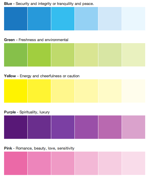
Designers claim that color scheme of the site also influences the conversion. Use colors according to the effect you want to produce on a visitor.
Meaning of the main colors:

Is it not worth saying that the Internet users do not like waiting. That is why low loading speed can become disastrous for a project.
If you face up this problem, check, how you can optimize the site: decrease pictures, graphics and scripts size. Or at least make the main elements load first in a page. You can check the loading speed with Google Page Speed Testing Tool. There you get a detailed report and advice on page optimization.
Publish high quality photos of real estate. The more perspectives the better. It will help a customer to view it in details.
It is better to be done and edited by a professional photographer.
A flat must look clean and neat. A photoshop will not help you if a flat is in a mess.
Add video or panoramas in a listing to demonstrate the object. Especially it is popular for selling properties or renting them out.
Usage of social networks during authorization can significantly simplify the registration for website visitors. Let your clients register in a convenient way.