^ Go up
You won't have a second chance to make a first impression.
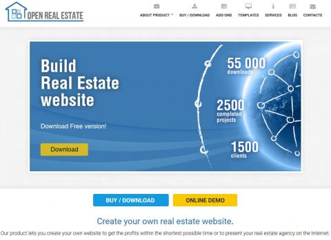
Potential customers often start getting acquainted with your business in your homepage. Just imagine, a user estimates the site in 1/20th of a second! That's why accurate prioritizing of the homepage may help you to make a user stay longer in a site and improve behavioral factors, which in its turn will be an advantage for promotion in search engines.
So what are the main principles which can make your page more efficient?
Important: a user should get a clear answers at a first glance to the following questions "who?", "what do they offer?" and "why is it profitable for me?". In other words, good homepage, or it's better say the first screen of the homepage is when at the first glance in a page a user can get the information about the company and its activity, and also about their own benefits if they order something there or complete a target action.
If a customer cannot find the answers to these questions in a homepage, they are unlikely to go on viewing the site and follow its other links.
Communicate with target audience in its language. Imagine a portrait of your potential buyer, think through their needs and troubles and with the help of content in homepage try to find a solution they need. Get rid of distracting elements and focus on how you can help your client to fulfill the tasks they have when opens the site.
Clarify your offer in an only sentence and show a customer their benefits. Ideally, a user shouldn't want to look for your rivals' offers in their websites.
Clear and precise organization of a homepage, fast performance, absence of gleaming banners, optimization for mobile devices will not only help a user to focus on the main product or service, but it's also a kind of a decency rule while communicating with users.
Don't use flash elements as it is very old-fashioned. For example, Chrome did away with visualization of information based on Flash long ago.
The main task is that a user complete a target action in a site. Moreover, to show the benefit, make a call-to-action block more noticeable in a homepage which will be a logical element in a page after description of all the advantages of the software or a service.
You can use several calls to action in a site, for example, the main one is to buy a software, the minor one is to subscribe to newsletters. Even if you don't sell anything, with the help of high-quality email newsletters you will turn a "cold" user into a loyal visitor and a potential buyer.
Improvements of the homepage is an endless process. Try to follow the web-development trends and use new efficient ways of attracting and holding customers, carry out tests and analyze visitors' behavior with the help of analytic systems. Only this way your site will meet the requirements of modern users.

 English